
Logo & branding
We've created some guidelines to help you determine the best way to use our brand.
Download pack coming soon!
Logo variations

1. Logotype
Logotype (horizontal)
Use as often as possible

2. Stacked logo
Stacked logo (vertical)
Use in marketing materials when space is limited

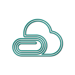
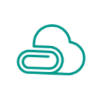
3. Glyph
Glyph
Use when space is limited

1. Logotype

2. Stacked logo

3. Glyph
Inverted branding is used on darker backgrounds
White brand on a coloured background. Use these sparingly, with the same guidelines above
We thank you for not recolouring, reshaping, editing or adding special effects to our logo.
Logo Usage
Use a coloured version of the logo on white backgrounds
Use inverted branding on darker backgrounds, and sparingly
Banners, app icons, and full screen launch images are good examples
Do not place the brand on colours that clash, but instead use the ones listed
Be consistent with the colour throughout a document
Instead of embedding the logo into text, write Binder in plain text
Use the inverted branding sparingly (white brand on coloured background)


We thank you for not recolouring, reshaping, editing or adding special effects to our logo.
LOGO Use and COLOURS
You should only use the Binder brand once on a page, and refer to the company name in plain text thereafter.
If you do find yourself using it twice or more, you should: be consistent with the colour and try to use the logotype or stacked logo for the first, and the glyph for the second.
Colour values
Pink
#ee4481
CMYK 0, 88, 20, 0
Light Blue
#478ecc
CMYK 71, 35, 0, 0
Orange
#f0592a
CMYK 0, 80, 94, 0
Dark Blue
#4454a5
CMYK 84, 76, 0, 0
Aqua
#009688
CMYK 83, 19, 53, 2
Black
#231f20
CMYK 0, 0, 0, 100
Purple
#8f3e97
CMYK 50, 90, 0, 0
Green
#4cae4e
CMYK 72, 5, 95, 0
White
#ffffff
CMYK 0, 0, 0, 0
Spacing
Logotype
Leave 33% spacing around the Logotype
The right edge of the glyph should be 20% away from the Binder type
Stacked logo
Leave 25% spacing around the Stacked logo
The bottom edge of the glyph should be 20% away from the Binder type
Glyph
Leave 25% spacing around the Glyph
While our spacing is quite precise, your best guess will be okay.
Application icons
Windows 7 and below
OSX & iOS
Android
Windows 8 and up

1. Windows 7 and below

2. OSX & iOS

3. Android

4. Windows 8 and up
Logos and images
Our logo represents who we are and what we do; changing it can distort our image.
Please do not alter, change, add to or modify our logo in any way.
Your Binder should not need any more of our logos or branding – we have already put them in! You can personalise your own Binder with your logos and images.
Please do not use our images or illustrations in any material without permission.
Names
Do not use the word "Binder" in any domain or site name, including variations and misspellings.
Do not use the word "Binder" in way that could be confusing or misleading, or suggest that you are endorsed by, affiliated with, or supported by Binder.